Best Practices for High Conversion Rates on Checkout Pages
Are you eager to improve your website’s performance without heavily investing in ads? Conversion rate optimization is something that any ecommerce business should focus on every here and there. It is like fixing leaky pipes; you should always follow the stream and fix holes along the way. The checkout page is the final step in the customer journey on your website.
Fast forward, when customers reach the checkout, you can almost celebrate; you are just one step from conversion. However, leading users to this point requires numerous steps. Product details pages (PDPs), product listing pages (PLPs), and the design of your crucial call to action aka "Add-to-cart button" all deserve serious attention.
If you are ready to master your website’s CRO, here we covered everything you need to know:
- Give your ecommerce a CRO boost
- Checklist of UX and A11Y features for PDPs
- Essential features for PLPs
- Advanced UX and A11Y features for your PLPs
- Hacking Add-to-Cart rate
- Tweaking CRO on checkout pages (this article)
Checkout or Leave
When your customers find the right products for them and decide to put them in the cart, it is still too early to call it a win. One more critical decision point is ahead. Users of your ecommerce are now considering whether they check out or leave your website.
Don’t expect to reach a 100 % conversion rate on your checkout page or checkout completion rate, as it's often called. Anything between 20% and 60% is considered average, according to the benchmark by Littledata.
“Your main goal is to remove all obstacles on the path from window shopping to actual ordering. User experience (UX) and accessibility (A11Y) throughout the checkout process should be smooth and straightforward,” explains Ondrej Pohl, the UX & A11Y Lead in ACTUM Digital.
The recommended way is to put yourself into customers’ shoes and review all steps of the checkout process:
- Start: Shopping cart
- Page 1: Delivery options
- Page 2: Payment
- Page 3: Log-in / Customer details
- Page 4: Confirmation
- Page 5: Thank you page
High-Conversion Checkout Pages
Intuitive structure and seamless shopping experience are a must for modern ecommerce players. B2C online sales have become highly competitive, with no room for lazy, sloppy, or faulty design features.
On the other hand, B2B ecommerce websites used to be very technical and hard to understand, but the trend has changed. B2B ecommerce companies must aim higher than B2C to stay in the game. No excuses; even the B2B sellers actively polish their CRO to achieve excellent performance on checkout.
It is an absolute must for everyone to adopt a mobile-first attitude because most conversions online stream from mobile devices.
“The holy checkout grail used to be a one-page design, but it is nearly impossible to squeeze everything into one screen. This recommendation quickly faded, and now we prefer distinctive pages for every phase as it works better for UX and A11Y,” adds Ondrej.
Best UX & A11Y Practices for Checkout Pages
Improving UX and A11Y on checkout pages is the final touch to the CRO picture. On our projects, we always utilize years of experience in various industry verticals and our thorough research of trends in user behavior.
B2C platform Yachting.com is an example of a cutting-edge booking system that shows the finest CRO practices. At the same time, in the B2B world, we delivered the optimized ecommerce solution for Dormer Pramet, the leading supplier of metal cutting tools with global impact.
“At each project, we respect our client's specific needs, and we craft user experience tailored to their target audience. Even though B2B and B2C are different in many ways, ecommerce development is always based on rigorous research and A/B testing,” shares Ondrej.
And now, let’s check features and tweaks that can help you improve your checkout completion rate.
One-page Checkouts Are History
Single checkout pages are not generally recommended. The better choice is dividing the checkout process steps into individual pages. Customers using mobile devices will especially appreciate the improved clarity! Just don’t forget to navigate users through the process visually so they always know where they are and what are the next steps.
Every standard checkout process contains these phases, even though their order might surprise you:
Cart
This page is the beginning of the checkout. It should tell users everything they need to know – display items in the cart, show a progress bar to free delivery, give an easy option to redeem voucher codes, and provide a clear overview of which ordered products are on or out of stock with an estimated delivery date.
Delivery options
The second page is a place with a list of delivery options. Use lists with radio buttons and illustrated icons for rapid recognition. Refrain from preselecting any choice, as it can be confusing. Plus, show additional prices you charge for each delivery type.
Payment
Next, it is time to choose a payment option. Remember to explain what will happen after selecting each method (e.g., you’ll be redirected to the payment gate PayNow after confirming the order, or all payment details will arrive in your mailbox). Use icons for easy navigation and always transparently show additional prices you charge for payment methods.
Contact details
Surprise, surprise, giving you the contact details is the last thing a potential customer wants to do. Ask for them only after the customers know everything about their purchase, delivery, and payment.
- User login. Your returning customers might already have their accounts, so make it easy for them to log in. It doesn’t mean there shouldn’t be an option to guest shop without registration.
- One-time shopping. If you offer customers to continue checkout without logging in, make both options equally important; failing to do so can be considered a dark design pattern. Also, do not annoy customers by asking for information you don’t need. And if you do, give them honest reasoning (personalized content feature, etc.).
Summary
It is the last page where users still have the option to leave your website without conversion. Display all the information selected by the user, items ordered, delivery, and payment, and add details about vouchers or discount codes. Then, make editing or correcting details simple and direct users to the related process stage after clicking on the edit button.
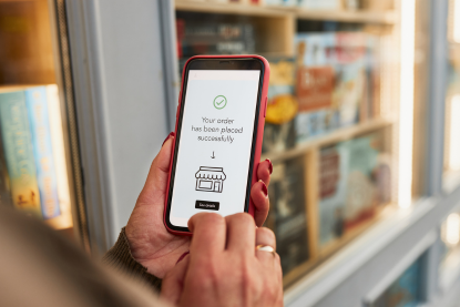
Thank you page
The most underrated part of the checkout process. Don’t think having customers click the Confirm-order button is the end of the customer journey. You scored one purchase; now it is time to build relationships and aim for customer satisfaction to increase chances for repeated orders. Use this space to show all relevant information (order number, contact details, email address where confirmation was sent, etc.) and allow them to make quick changes like adding forgotten items into orders if possible.
Having the checkout process roughly done, here are a few extra tips to push user experience from OK to stellar:
Total price
Users want to see an updated total throughout the checkout process. Display the final price where customers always see it, including delivery and payment fees and applied discounts.
Web Accessibility
- A smooth user experience is just one part of increasing the checkout completion rate. Ecommerce websites need to focus on web accessibility that helps all users interact with their websites regardless of their health.
- Be as clear and specific as possible, especially when describing the progress bar and overall checkout navigation. For example, use the “go to payment” button rather than the “next step” button.
- Help users with screen readers. E.g., if any error occurs, change its aria:label programmatically or set focus to the original place when the page was reloaded, typically after changing quantity.
- Do not open a list of pick-up places in the pop-up window automatically; instead, show the “Select pick-up location” button after setting the pick-up delivery method and let users select it at their own pace.
- Check whether third-party providers of plugins and tools use accessible designs for their interfaces. E.g., payment gateways.
- Never put too many input fields on one page; break them into sections. In addition, make them compatible with autofill features using the correct field types and names.
Tweaked mobile checkout experience
Mobile devices allow advanced personalization of shopping experiences. Use the user's location to estimate delivery costs, taxes, and delivery date before you know the exact address. Mobile design should provide a clear path to frequently used actions – visit the cart, change the quantity, and remove products from the order. Make sure to follow best practices for mobile development, e.g., using correct keyboards for input types, real-time updated prices, support of the shopping experience across multiple devices, etc.
Payment cards
Never push users to enter card numbers manually. Allow options to populate the card details from photos via OCR or support integration with digital wallets like Google Pay or Apple Pay, which makes the payment process faster and more secure than typing card details by hand. Use only options customers use; do not overwhelm them with exotic features.
Get Maximum Conversions on Checkout Pages
Feel free to use our tips for inspiration, as we are glad to help improve everyone's online shopping experience
“It’s little things that make a difference. Not only by accelerating the purchase process but with web accessibility on the radar and by including all users in the experience,” highlights Ondrej's importance of A11Y in online ecommerce.
With the checkout process optimized, the CRO is not over for you. It is never over for anyone. Now, measure performance, collect data, and return to the start of the customer journey. At least one optimization loop a year is all it takes in the era of dynamic ecommerce development.
You will see exciting insights hidden under every stone you turn.
_________
If you need help implementing new features to your ecommerce solutions, we are here to put you back on track in the ever-changing ecommerce landscape. Subscribe to our newsletter for more hands-on tips and insights into the world of UX and accessibility.