Checklist: 30 Must-Have Features for Product Detail Pages
The world of ecommerce is a bustling arena of constant change and evolution where online product presentation is crucial to business success. Everyone serious about the effectiveness and performance of an online store or digital marketplace should carefully craft Product Detail Pages (PDPs). Let’s get through our checklist of 30 recommendations guaranteeing stellar usability and accessibility.

PDPs are a central element in the equation, playing a decisive role in the whole Conversion Rate Optimization (CRO). Before going through this checklist, definitely see our previous article about best CRO practices focused on B2B ecommerce.
Why does the design of product pages matter? A recent study by Forbes revealed that brands with superior User Experience (UX) generate 5.7 times more revenue than competitors lagging in UX.
In most cases, your customers make purchase decisions right on the product pages. Considering the rise of the digital natives' generation into executive and purchasing roles, UX design can be a cornerstone between stagnation and growth.
Ongoing digitization brings an incredibly diverse range of users online, extending the pressure – perfect UX must be followed by frictionless accessibility of every piece of digital content. You can't ignore these two parts if you dream about well-performing PDPs as a robust foundation for your business goals.
________
Serious about transforming your ecommerce? Let’s talk about your website with Actum’s design experts. Get your free 30-minute consultation now.
________
User Experience (UX) & Usability
User Experience (UX) is much more than art; it is science. Crafting a seamless, engaging journey for your online visitors goes beyond aesthetic appeal; it requires the thought-through architecture of your website's easily-navigable content organization resulting in a smooth user flow.
According to a report, almost 9 out of 10 visitors to ecommerce are ready to abandon your website for a poor user experience, switching your website for competitors. Even the very first impression matter, as 79% of visitors will leave because they simply don’t like your user experience and interface.
UX's main goal is to satisfy users' needs efficiently, fostering positive experiences that keep users engaged with the product and brand. Lack of which can result in weakened brand loyalty.
Well-curated user experience on your product pages enables you to create customer journeys most conducive to business success, leading visitors to the shortest way to conversion. To put it briefly, create user scenarios that will boost your CRO.
Digital Content Accessibility (A11Y)
Have you ever tried to navigate your smartphone with sunglasses on? Or order your weekly grocery while juggling a cup of coffee in one hand? We all have moments when our senses are temporarily disabled or impaired, making accessibility of digital content handy not only for people with permanent disabilities. Accessibility (people came up with the numeronym A11Y – keeping A from accessibility, 11 for eleven letters in between finished with Y) is an ally to all of us.
"Rules of web design have changed. Successful websites can’t rely solely on visually engaging design; they need to create a genuinely welcoming and accessible environment for everyone – a benefit we can all appreciate. Brands' focus shifts from aesthetically pleasing stunts to usability and accessibility. Overdone design won’t work these days; only skillfully crafted interfaces where everyone can find what they want. Even when their bodies and senses do not function properly for any reason," explains Ondrej Pohl, Accessibility & UX Director at Actum Digital.
A11Y is an essential aspect of digital experiences nowadays; it is currently mandatory for all digital services in the US and only for public bodies in the European Union. By 2025, accessibility requirements will also apply to ecommerce, phone carriers, transportation, financial services, and others. Remember that any not accessible service is conducting discrimination against people, as stated in the UN Convention on the Rights of Persons with Disabilities (CRPD), Article 9.
Most digital accessibility legislation is based on the Web Content Accessibility Guidelines (WCAG). It’s a set of rules defining minimal foundations for better accessibility. It cannot cover everything that must be done for accessible experiences, but it is a good start.
Shockingly, almost 96.8% of homepages still demonstrate detectable WCAG failures, with more than 50 errors per home page, according to WebAIM. The number of internet users since 2000 increased by a stunning 1,355%, bringing older and wider demographics online based on Broadband Search data. Today, the WHO estimates that 15% of the world's population suffers from some kind of permanent disability.
Remember, accessibility is more than aiding people with permanent disabilities like blindness, deafness, or cognitive limitations. It's about designing for all, including everyone with temporary or situational impairments.
Let’s check how permanent disabilities translate into temporary or situational impairment to understand why accessible designs help everyone:
- Blindness and low vision → using a laptop or phone in direct sunlight
- Deafness and hearing loss → watching videos on a smartphone on public transport without headphones
- Limited movement → using a smartphone on the go or after a hand injury
- Speech disabilities → browsing websites when in public or open space office
- Neurological limitations → shopping under time pressure or distractions
- Cognitive limitations → purchasing when tired or not entirely focused
Fostering an inclusive online environment where everyone can engage independently and with ease is Actum’s mission.
Checklist of UX and A11Y Features
Ready to get your hands down on battle-hardened advice from our UX and design team? Let’s split them into a few categories so we don’t mix UX and accessibility together. Going through the checklist, feel free to browse your ecommerce or marketplace, ticking off recommendations you have already adopted.
Does your online store need to include some of the listed items? Open your Jira and assign a new task to your team!
20 Usability Recommendations
A finely-tuned User Experience (UX) is your secret weapon on the digital battlefield. To help you succeed, our UX experts put together 20 essentials for high-performing product detail pages. Don’t neglect your PDPs' usability; it is the make-or-break of your online presence.
Must-Have
- Descriptive product names.
Just like a catchy headline grabs attention, your product names must resonate with clarity. If offering variations, ensure the differentiators (size, color or package quantity) are included in the name. You aim to preempt any customer confusion. - Product details.
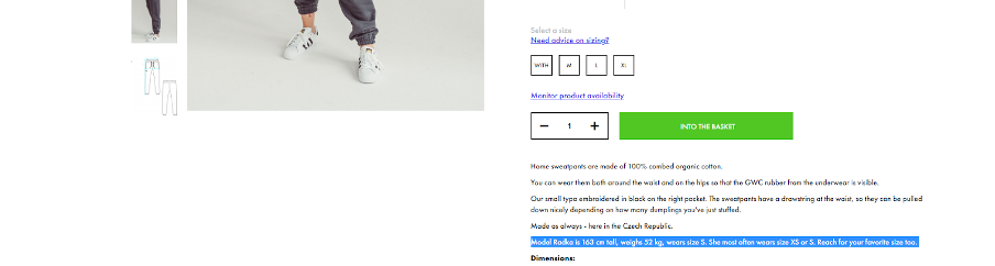
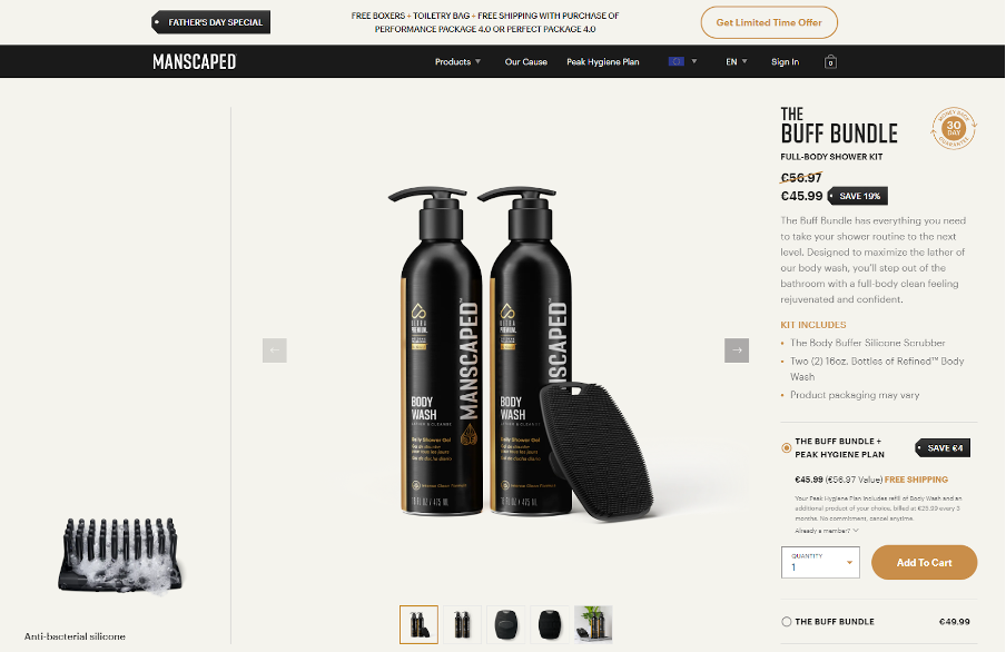
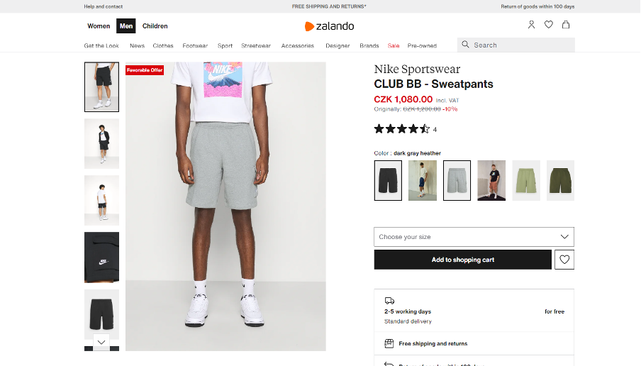
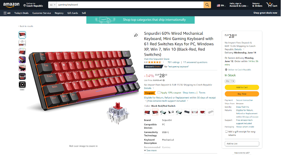
Information on the PDP should present visitors with all information like availability, options, sizes, colors and selection of their product. Leave no room for ambiguity. - Recognizable images with zoom.
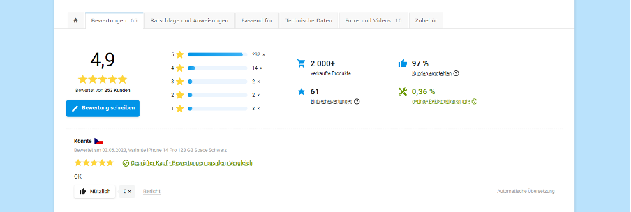
Your product's visual appeal is its first impression. Provide vivid images with a zoom function and add innovative views like rotated, detailed views, and 3D animations. - Customer ratings.
Peer opinions are a powerful motivator. Leverage customer reviews fully, offering to sort and filter reviews by date, rating, or keyword.
- Value proposition.
Keep the spotlight on your customers. Rather than stating what you do, highlight what value they receive. Incorporate your value proposition throughout the funnel, from PDPs to category and cart pages. - Clear price above the fold.
The price tag shouldn't play hide and seek. Display it prominently above the fold, ensuring visibility even on smartphones. - Add to cart.
Your 'Add to Cart' button is the star of your PDP. Make it conspicuous and offer clear feedback upon successful addition. Avoid redirecting customers to the cart after each adds, as it may dent your average order value. - Product description.
Your product description is the narrative of your product. Is it understandable? Do you use plain language with minimum jargon? Can you read it without zooming? Does it describe every aspect of the product? If yes, you're on the right track. - Stars and scores.
If your ecommerce offers more products, ratings can serve as a helpful guide. Display average product ratings and always help users make decisions by sorting products from the highest-ranked. - Give answers.
Though seemingly minor, describing details in your images, such as model measurements, clothing sizes, or product variant details, can reinforce customer trust and decision-making.
Nice-to-Have
- Urgency elements.
Elements suggesting urgency can spur conversion rates. However, refrain from employing 'dark design patterns.' Ensure all numbers, such as remaining stock or current viewers, are true and accurate to avoid hostile perceptions. - Secondary CTAs.
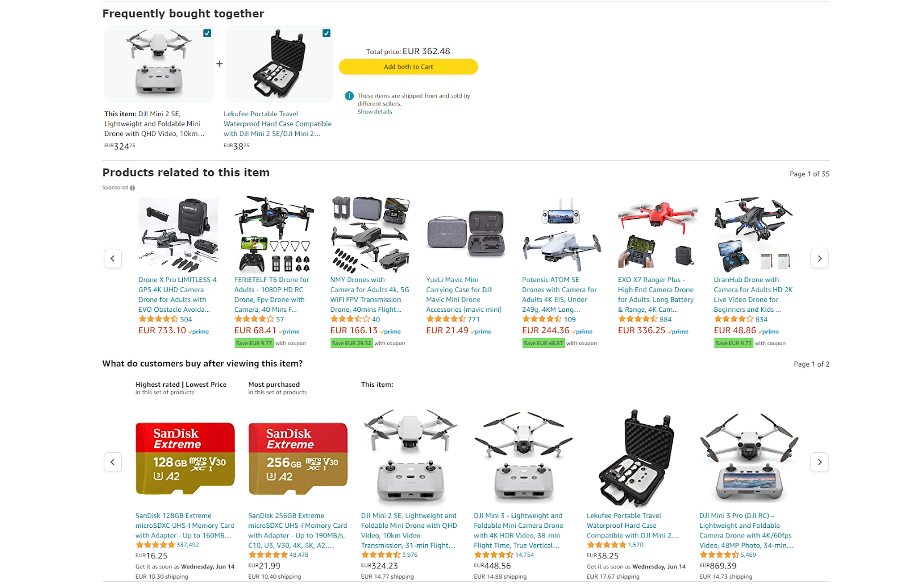
The 'Add-to-Cart' button shouldn't monopolize the action. Try wearing your visitors' shoes, who sometimes need more time, information, or contact on different devices. Offer secondary actions such as 'Compare', 'Watch price', 'Email Me', or 'Call Me'. - Products recommendations.
Intelligent ecommerce platforms suggest product recommendations based on machine learning and AI. Showcasing related or alternative products on your PDPs can expedite purchase decisions.
- Wishlist.
Our fast-paced lives often make us postpone decisions. Allow your customers to bookmark their future purchases with a wishlist feature. Invite visitors to register their email and save their choices. - Icons with text.
While iconography adds visual appeal, its meaning may not be universally understood. Always pair icons with text descriptions for clarity. It applies even to your logo, as average visitors will focus on it for 6.48 seconds – don’t miss the chance to help them remember you.
Extra Mile
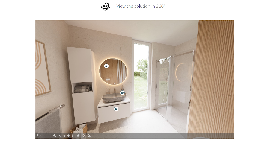
- 360° product views and videos.
Tech-savvy sellers leverage 360° product animations, tutorial videos, and step-by-step guides to enhance understanding. The more your customers know about your product, the more likely they will buy. A recent study showed that visitors stay 88% longer on web pages with videos.
- Virtual try-on (augmented reality).
If your audience is digitally skilled, offer advanced features like Virtual and Augmented reality (AR & VR) for product try-ons, creating a unique and personalized shopping experience. - Photo or video reviews.
While professional images are essential, consider enriching your PDPs with user-generated content for a touch of authenticity and trust. - Product customization.
Offering product customization options can be a game-changer. While not always feasible, simple customization tools or discounted bundles can boost conversions. - Recurring or subscription-based option.
One-off purchases may not suffice for brands active in mature markets. Consider a subscription-based option. Selling software as a service (SaaS) is obvious, but recurring purchases like quarterly body wash refills can do wonders too.
10 Accessibility Recommendations
Once your website's usability is in top gear, it's time to open the gates for all users to relish the tailored user experience. You would be surprised how many users encounter barriers on the web, not only because they have some kind of disability but because they have different experiences, nature, language skills, time options, cultural customs, digital literacy and much more. Also, some use assistive technologies such as screen readers that convert text and elements into speech or Braille output.
Making your site barrier-free requires long-term focus and effort. Accessibility is not a one-time project but a continuous effort that never ends, the same as your development of new features or improving security.
The most important A11Y recommendations make visiting your website a pleasant journey.
- Breadcrumbs navigation.
Include breadcrumbs navigation on the product detail page for users to comprehend their location within the website structure easily. Make sure users can interact with breadcrumbs for effortless navigation. - Color variations by text.
Color descriptions are crucial for colorblind users or those with limited sight, so avoid using only color for selection.
- Modal windows.
Ensure screen readers announce modal windows and can be closed with the ESC key or by interacting with the standard close (X) button. - Image alts.
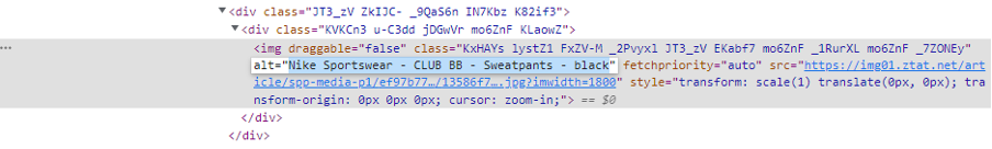
If there is an image on the website that is not decorative, it needs to come with an alternative text. This text should be descriptive and convey the meaning and context of an image or other non-text content. However, Web AIM estimates more than 23% of online images still need to include alternative text.
- Visual descriptions.
Describe even visual aspects of the product in the product description. Describe verbally the product's visual appearance right on the PDP page or in the alternative text of all product images. - Add to cart.
The 'Add to Cart' button should have the aria-label attribute specifying which product is being added to the cart. - Quantity.
When setting default quantities on your website, always choose one. Enable quantity adjustments using the + and - buttons or manually typing into the input field.
- Color contrast. Don’t be like 84% of websites that, according to WebAIM, use low-contrast text. Follow the WCAG rules for color contrast, particularly for Call-to-Action buttons, navigation, and website control elements.
- Mobile. Ensure no floating elements when viewed on mobile devices, as they can block users from using the entire website via the zoom feature.
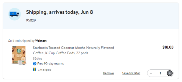
- Previous price. Strikethrough prices can be misleading, and screen readers do not announce them. To maximize accessibility, always accompany such prices with a 'Previous Price.'
Make Your Website a Better Place to Be
Creating an engaging, accessible, and conversion-optimized ecommerce site is a dynamic, evolving task. Our checklist aims to help you craft superior product detail pages by incorporating the essential UX and A11Y recommendations.
Focus on usability and accessibility rather than just aesthetic appeal. Remember, every detail is vital in enhancing user experience, and this commitment will result in increased customer satisfaction and business growth.
The task isn't as simple as just ticking off a checklist; it's about understanding and satisfying your users' diverse needs and limitations, making your website an inclusive, welcoming space for all.
_________
Do you need help with adaptation, learning, and improvement to keep up with the ever-changing ecommerce landscape? Join our design specialist for a 30-minute free consultation.
You may also like...
[17/04/2023] Boost Product Page Conversion Rate through Marketing Automation
What’s the lowest-hanging fruit in ecommerce? You are right; it’s your online conversion funnel...
Read the Insight[28/03/2023] How to Create a Step-by-step User Scenario
The most effective way to gain insight into your customers’ wants, goals and motivations is through user scenarios. Find out how you can create them.
Read the Insight