Next level of Product Listing Pages – 17 Advanced Features
Optimizing your product listing pages (PLPs) is a valuable aid in any conversion rate optimization effort of your ecommerce. We bring you a checklist of advanced usability and accessibility features that you can incorporate to engage potential customers and encourage them to finish their purchases.
Before diving into the checklist, it's essential to understand the significance of user experience (UX) and accessibility (A11Y) of your PLPs for conversion rate optimization (CRO).
Common practice is taking conversion (usually purchase) as a starting point and optimizing all the steps before interacting with the “CONFIRM ORDER” button. An easily navigable cart and convincing UX and A11Y of your product detail pages are the priority. Then, it is time to optimize product listing pages (PLPs).
Ready to master your website’s CRO? We put together everything we know in these articles:
- Give your ecommerce a CRO boost
- Checklist of UX and A11Y features for PDPs
- Essential features for PLPs
- Extra features for PLPs (in this article)
And when you are done with the basics, we can dig deeper into the advanced functionalities you can add to your PLPs as extras. Just be sure to think twice before acting on our tips, as ecommerce comes in many forms, and new features should always be tailored to the target audience and industry specifics.
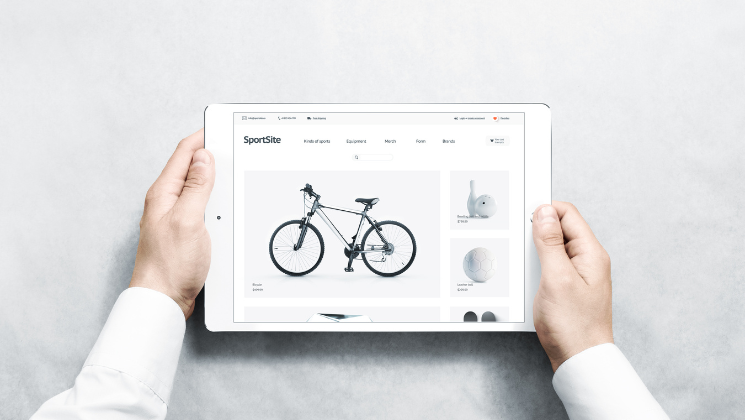
What is the Product listing page (PLP)?
- Search result page
- User custom filter listing
- Category listing
- Discounted items
At these pages, your users first land when browsing products; as such, they play a vital role in catching their attention and guiding them toward completing a purchase.
CRO Rules the Ecommerce
Let’s sum up the main goal of any ecommerce business, B2C or B2B. It’s converting users into customers. The discipline to get the maximum out of your website or app is called conversion rate optimization (CRO), a set of techniques to improve user experience and create a smooth journey from entering your website to the final conversion.
CRO combines graphic design, development, sales, and marketing to present the value of your company's products and services. Making changes and adding new features to your website should improve the UX and A11Y of your ecommerce, resulting in higher conversion rate, revenues, and, eventually, profit.
________
Serious about transforming your ecommerce? Let’s talk about your website with Actum’s design experts. Get your free 30-minute consultation now.
________
A/B testing and user observation should always confirm that the changes are helping your CRO, not hurting it, which requires a lot of effort and time.
Our team created a checklist of 17 extra features that they found helpful for PLPs' performance based on their experience.
Checklist of Advanced UX and A11Y Features for PLPs
When we say advanced, we really mean it. Don’t take this list for granted; some features are only helpful when your ecommerce includes thousands of items, sells FMCG, or focuses on the highly technical B2B niche market. On the other hand, there is never enough inspiration, right?
General Functions and Design Features
- Inclusivity.
In the fashion and clothing industry, inclusivity is a new norm. Be sure to display your products next to models of diverse races, ages and sizes. Your customers will appreciate it, and it might even attract new audiences to your business regardless of your industry.
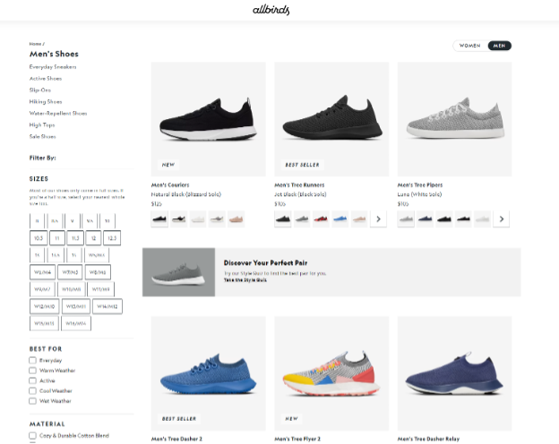
- Grid setup.
Research showed that displaying more products in the grid outperforms efforts to maximize image size and display one product per line. Always aim for 2–4 images per line on your PLPs.
- Visual spice.
Speaking of listing grids, try enriching them with visually exciting clues. Add something your users appreciate, such as a wishlist button, best-seller badge, stock availability, or information about color and size. Showing available sizes and colors directly on the listing saves your customers time.
- Be surprising.
In the first place, UX design should be predictable. Add some visual surprise to cut through the routine to avoid boredom in your listings. For example, break the grid layout, add seasonal banners, highlight best-selling products, or introduce related categories.
- Crafted CTAs.
Always create user-friendly calls to action (CTAs). If you sell rather complicated products, choose the “Show details” button, but if you are FMCG ecommerce, the “Add to cart” button might be a better choice as hardly anyone will read the product description of skimmed milk. In case you are unsure, stick with the first choice; most users add products to the cart from the product detail page anyway.
- Keep the listing clean.
Show only products you can sell, and drop out-of-stock items at the bottom of the lists.
- Adjustable listing.
Consider allowing users to switch between grid and row views. Rows are especially handy for repeatedly purchased products like B2B supplies and groceries.
- Find a balance.
Using too many labels and elements on the cards on the listing page can quickly become overwhelming. Use visual elements and badges wisely so you don’t push users too far – they quickly become blind to anything they don’t need.
Filtering and Sorting Category
- Thought-through sorting.
Your most effective sorting in the listing view is “Our recommendations.” It can be based on the amount of products sold in the last month or complex criteria considering personalization, profit margin, availability, etc. For numeric criteria (price, ratings), always use both options, from highest to lowest and vice versa. Simple alphabetical sorting might get handy (books, movies), but generally, you reach a higher conversion rate when sorting products by popularity, ranking or discounts.
- Organize filters.
Always show the most relevant filter categories first. You can base their order on your opinion and expertise or data from user research uncovering the preferences and behavior of your actual customers. Resist the urge to go from the most general (color, brand, size) filters and drill down to specific metrics. Imagine selling products where one or two aspects are particularly influential, like smartphone chargers where you look for USB-C, Lightning or contactless rather than exact brand and color.
- Avoid jargon.
Strive to make your product listing pages as straightforward as possible. Avoid using hard-to-understand jargon in filter categories and their value labels. Focus on clear, technically correct terms that even novices in your field will know. Remember that users don’t use filters they don’t understand and can’t predict their behavior.
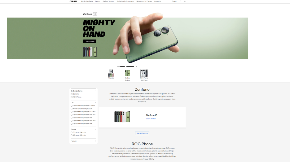
Give Special Care to Category Listings
- Like a homepage.
Category pages are often the most critical kind of PLPs, acting like narrowed-down home pages. Show a selection of a few products and let users choose from relevant subcategories whenever reasonable. The only exception is when your portfolio is limited to tens of products, and subcategories would remain empty. In other cases, get the maximum of this extra feature – it adds clarity to UX and improves search engines' ranking.
- Must-have for marketplaces.
Ecommerce marketplaces with thousands of items extensively use categories drilled down to fine-detailed subcategories. It helps users with navigation when every category page acts as a starting point for their purchase, no matter how specific the product they are looking for is.
- Educate about the category.
Use the category listing page and the space to educate users about hard-to-understand goods like electronics or industrial hardware, adding unique selling propositions to your business.
- Images to faster navigation.
Help users to navigate through the category tree. A category named “Gaming laptops” is good, but adding an easy-to-understand red-lid gaming laptop icon will accelerate navigation through your ecommerce, even when your list of categories is not vast or complex.
- Don’t remove shortcuts.
Even though category listings are helpful, remember to give users an easy option to skip them. At any point, users should be quickly able to start filtering and sorting a complete list of your products with the minimum additional steps.
- Hybrid approach.
Also, consider combining listing pages and category pages. Many ecommerce sites now use brief category descriptions and short subcategory menus within the main product listing page, making it fit users and their preferences.
Never Underestimate the Power of PLPs
Have you found inspiration for further improvement of your product listing pages? We hope you have! Working on customer journey and conversion rate optimization (CRO) is a never-ending effort for every ecommerce site. Try adding advanced features from our checklist and get your website’s UX to a whole new level.
These advanced tips are level two; always offer your customers essential UX and A11Y features. Start from the bottom, and soon, you’ll be here!
_________
If you need help implementing new features to your ecommerce solutions, we are here to put you back on track in the ever-changing ecommerce landscape. Join our design specialist for a 30-minute free consultation.
You may also like...
[11/08/2023] 23 Essential UX and A11Y Features for Product Listing Pages
Ready to improve your product listing pages (PLPs), taking them to the next level? Whether you're new to the world of ecommerce or a seasoned pro, there are basics that every PLP should have.
Read the Insight
[16/06/2023] Checklist: 30 Must-Have Features for Stellar Product Detail Pages
Discover best design practices for usability and accessibility of product detail pages. Let’s get through our checklist of 30 recommendations.
Read the Insight
[17/04/2023] Boost Product Page Conversion Rate through Marketing Automation
What’s the lowest-hanging fruit in ecommerce? You are right; it’s your online conversion funnel...
Read the Insight