Hacking Add-to-Cart Rate with CRO Best Practices
The heart of every ecommerce is the shopping cart. This universal truth applies to all online stores, no matter that every site is one of a kind. Despite their uniqueness, our tips help you effectively navigate visitors from product pages to the cart on any website. Optimize your conversion rate throughout the visitor journey and use the “Add-to-cart” buttons wisely. Let’s hack it!

The add-to-cart rate is a popular metric used in ecommerce for conversion rate optimization (CRO) efforts. It simply states how many total visitors added some product to the cart, as this simple act is solid proof of serious interest in actually making the purchase.
Make adding to the cart confusing, unpredictable, or too complicated, and you risk a significant drop in conversion rate. On the other hand, improving user experience (UX) and accessibility (A11Y) might help you solidify a bunch of new orders almost magically, just from thin air.
Can’t wait to tweak your add-to-cart process? Hold your horses; check all prerequisites for boosting your CRO.
Step by step, work your way through the conversion funnel:
- Give your ecommerce a CRO boost
- Checklist of UX and A11Y features for PDPs
- Essential features for PLPs
- Advanced UX and A11Y features for your PLPs
- Hacking Add-to-Cart rate (this article)
The crucial CTA: Add-to-Cart
One single call to action (CTA) transforms visitors into customers. You might guess it is “Order now”, but that’s not completely precise. The breaking line is the act of adding goods to the cart, as this is the first action indicating that your visitor is ready to continue with the purchase, becoming a customer. The add-to-cart button is the king.
“Without adding products to the cart, there will be no transaction for your online store. All users must clearly understand how to put items into their order. And your goal is to motivate them to finish this action before they leave your site,” explains Ondrej Pohl, the UX & A11Y lead in Actum Digital.
Yes, it’s not only about where to put the crucial button and which colors to use for its design. The add-to-cart button is rocket science, including disciplines like predictive feedback, sales incentives, human psychology and much more.
Don’t you believe? Try our simple test. Put yourself into customers’ shoes and tell us what you find out!
Hacking Add-to-Cart Rate with UX & A11Y
As we mentioned in the beginning, every ecommerce site is unique. Do you sell fast-moving consumer goods? Tours with accommodation? Fashion? Parts for power plants? There are huge differences between the needs of B2C and B2B customers. Hack wisely because what might work for one group may become entirely useless for the other.
If you are unsure whether your site needs improving, the global add-to-cart rate benchmark is 7.9 % (share of visitors who interacted with the add-to-cart button). Based on your business category and industry, this number can range between 4 % and 12 %.
Are your numbers within the range? Check our tips anyway; there is always room for improvement.
That is why we split our list of tips into two parts:
- Best practices for everyone
- Advanced features
The second part contains specific features you should thoroughly consider and test on your target audience. Not all online stores need all of them.
Add-to-Cart Best Practices
We put together the know-how of UX & A11Y experts in Actum to help you instantly improve the performance of your online store. Our specialty is optimizing global B2B ecommerce sites, yet B2B often overlaps with B2C. A beautiful example of this merger is our ecommerce solution for SIKO, wholesale with bathroom and kitchen products
“Cutting-edge user experience isn’t the competitive advantage anymore; it is the new normal. The same pressure that pushed digital developers to offer flawless UX now forces ecommerce businesses to become inclusive, enhancing their accessibility for all people,” Pohl highlights the importance of developing digital solutions that are easy to use by users regardless of their physical or mental abilities.
_________
Ready to boost your add-to-cart rate? We are here to help! Join our ecommerce specialist for a 30-minute free consultation.
_________
Add-to-Cart Button Placement
Obviously, this crucial button should always be accessible from the product detail page (PDP). The question is, where else should you have it?
- Product Details Pages (PDP): Definitely yes!
- Product Listing Pages (PLP): People might want to add Simple or often-bought products to their cart straight from the lists. More complex products should instead come with the view-details button.
- Search Bar: Similar logic applies to search results as each query generates some listing, right?
- Content pages: Lastly, there are various content pages like blog posts, microsites, or landing pages where your products might be displayed. It might be nice to place the add-to-cart button right next to them.
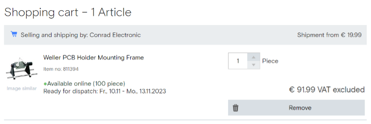
Clear Feedback
Have you interacted with the add-to-cart button? You should get a clear signal that the item was successfully added. You could even confirm they chose the right size, color, or any other variant. Be careful when selling goods by square meters or kilos; it can quickly get messy.
Pop-up windows or animated confirmation banners are the main ways to tackle this issue, for single-product purchases might better work with a stand-alone interstitial page flowing directly into the order process.

Change of Add to Cart button
Show a green checkmark or the number of products in the cart with buttons to add or remove quantity. Your goal is to display that the item was added to the cast and prevent users from overthinking their actions.
Creating Urgency
Think about gently pushing your visitors into action. You undoubtedly know this practice, but it may come in many shapes. Show available stock, the number of people browsing the same product, or give a time-limited discount. Any of these motivators must be based on truth to work effectively.
Badges on Cart Icon
Most websites come with a cart icon in the upper right corner. When items are added to the cart, the icon should show a badge indicating at least the number of products in the cart. Or better, displaying the order subtotal. Just be sure to use contrasting colors for these badges.
Add-to-Cart Advanced Practices
Have you already fixed the basics, and are you hungry for more? User expectations are constantly growing, and what they know from ecommerce giants sets the standard even for B2B businesses. B2B must go beyond Amazon to attract and retain online customers.
“B2B online sales come with many specifics. The customers need advanced tools that are slightly different from the B2C world. Before adding to the cart, they seek information like the cost of delivery, which is a complex discipline when it comes to, for example, bulk construction material. Or the need cart export/import feature for integration with their ERP system taking care of automated orders,” Pohl lists the main reasons why designing the converting cart is such a challenge.
Email Notifications & Cart
When something is out of stock, you risk losing the potential customer. Your only hope is to hook them by adding offering email notifications! And when sending the notification that the product is back in stock… Yes, don’t forget the add-to-cart button in that email! These notifications work great for restocking as well as price changes.
Wishlist & Cart
Do you offer your customers the option to create their wishlists? Go one step further and think about the moment when they are ready for their wishes to come true. Allow them to add items from the wishlist to the cart effortlessly.
Mini Cart Feature
One cart is never enough. The UX trend is to use the mini cart to preview items in the cart or adjust their quantities without leaving the current page. Picture a pop-up window that appears over the page when you interact with the cart icon instead of dragging users to the cart page away from their shopping adventure.
Automating Orders
This feature is handy for B2B e-commerce with tens of thousands of items in their portfolio. To automate the order process, you should enable users to save and import the cart to a CSV file. The next step is to allow them to repeat the order using previous orders as a template. Another way is to create a quick order option to add to the cart the set of essential items your customers order almost every time.
Spicy Ecommerce
Improving the add-to-cart rate sometimes requires creative thinking. Here are some ideas to spice up your online store, motivating users to fill up their carts:
- The day of the earliest delivery is displayed on the product detail page, in the cart, and at checkout.
- Free delivery progress bars indicate how much the user needs to be eligible for the free delivery. Do your math homework and then communicate this offer through the storefront.
- Product promotions in the form of badges and banners might light up your website. Consider buy-one-get-one-free, 2 for the price of 3, gifts, etc.
Add-to-cart for Post Purchase
Sometimes, your users realize they want to buy something right at the moment when they confirm the order. Remind them to grab accessories or extra cartridges even after the purchase is made; just be careful and make it easy for them to add new items to the existing order, especially regarding the payment and invoicing process.
UX Pruning
So far, we have been adding stuff to your online store. When you are done adding, it’s time to get back to square one and start over with the pruning scissors in hand. Test, measure, and plan what your customers find helpful. Anything that doesn’t help your customers must go away.
Improved Add-to-Cart Rate Helps Conversion Rate Too
The sales funnel is a vicious machine. View the product, add it to the cart, start the order process, confirm the order, and make payment: a few stages, each with a significant dropout rate. But there is a light at the end of each funnel. If you can get more people to the next step, you will likely improve the overall conversion rate.
„Every ecommerce website is like a maze. The only difference is that there are no dead ends in it as all routes lead to the conversion,“ summarizes Pohl, the golden rule of UX design.
Increasing the add-to-cart rate will pass more visitors into the following stages, improving the chance they will reach the end of the maze and successfully become your customers.
_________
Sign up for our monthly newsletter to receive hands-on tips for boosting conversion rates. If you need help implementing new features to your ecommerce solutions, we are here to put you back on track in the ever-changing ecommerce landscape.
You may also like...
[25/08/2023] Next level of Product Listing Pages – 17 Advanced Features
Explore how to optimize your ecommerce product listing pages with advanced usability and accessibility features, boosting user engagement and conversion rates.
Read the Insight
[11/08/2023] 23 Essential UX and A11Y Features for Product Listing Pages
Ready to improve your product listing pages (PLPs), taking them to the next level? Whether you're new to the world of ecommerce or a seasoned pro, there are basics that every PLP should have.
Read the Insight
[18/05/2023] Why Does B2B eCommerce Need to Go Beyond Amazon
Digital commerce evolves B2B eCommerce, demanding Amazon-like experiences. But replicating Amazon isn't enough; B2B must go the extra mile.
Read the Insight